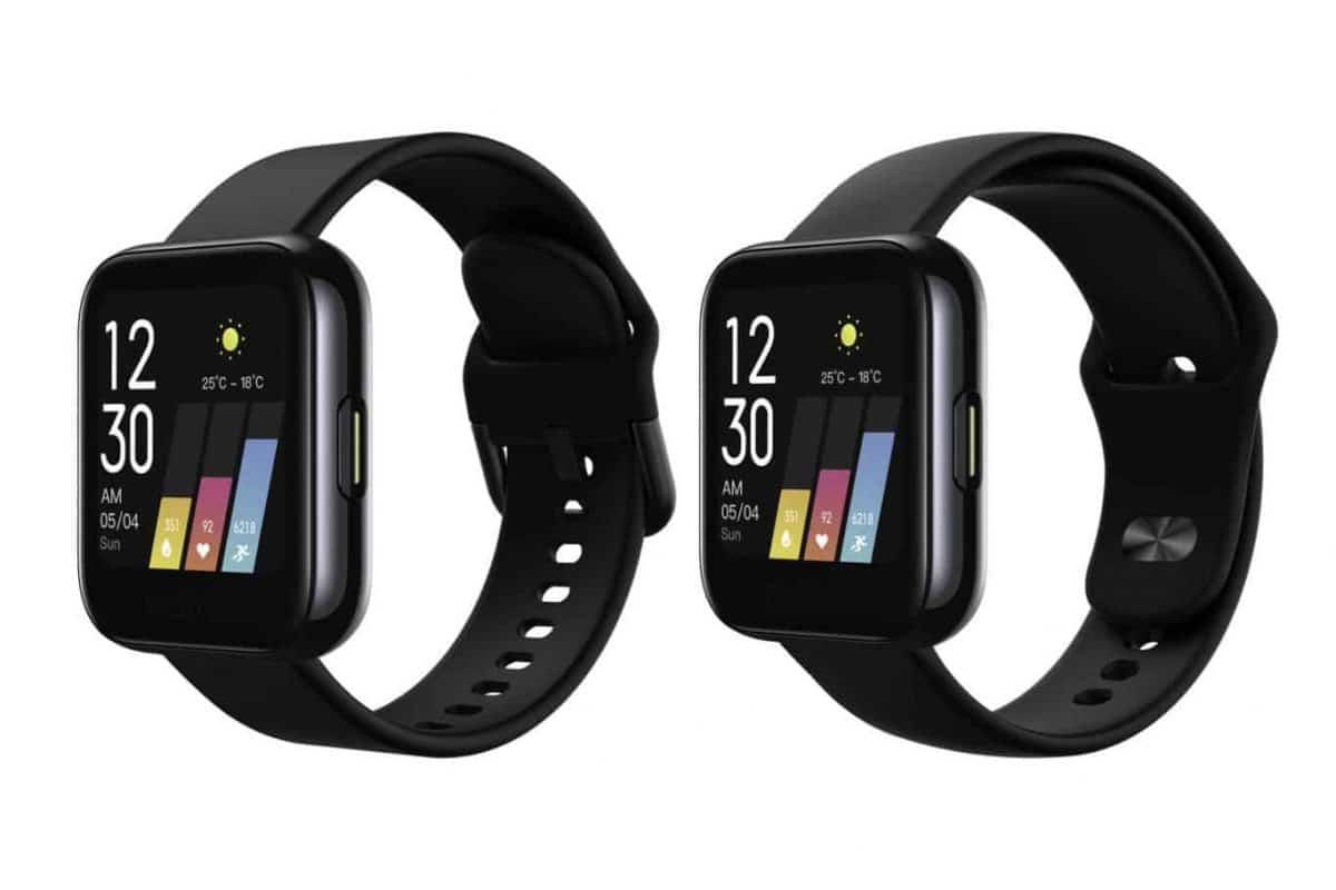
Mi Watch, Xiaomi’s new watch based on the Wear OS Operating System, promises a lot! Bringing to the table an interface completely customized by the Chinese giant, as well as specifications that only found in the most well-equipped models of the market like the Fossil Gen5 … At a price that should be around 180 €!
Page Contents:
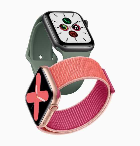
However, this watch eventually turned out to be a true copy of the Apple Watch market king. That is, Mi Watch is for many, the Apple Watch of the Android world… And good! (Apple’s solution dominates with ~ 50% market share).
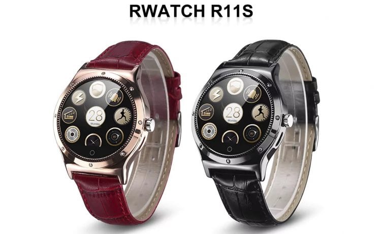
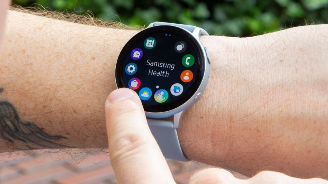
That said, many have a doubt in their minds… Why did Xiaomi decide to opt for this design? Why not use the same circular design you used on so many other models, like Pace, Verge or Stratos? Well, the company has already gone public to explain its reasons! And in fact, they even make sense. Now read:
1. Better utilization of available space
Yeah… It’s hard to deny that a rectangular screen with the same area as a circular screen will be able to show more information. After all, this is the big reason why the vast majority of electronic devices leave the circular screen in the drawer! Text or cropped images are a big no.
2. Easy content reading
Consumers are used to reading in a rectangle. After all, from books to screens, the ones who dominate are the rectangles.
3. Best for navigation
Xiaomi says this format is also better for navigation. Since being rectangular, it is easier to navigate to any of the 4 directions. Incidentally, the MIUI for smartwatches was designed for that.
Still still prefer a circular screen Mi Watch! You may be lucky…
Some rumors claim that Xiaomi will release a Pro version in a few months, which in addition to bringing better hardware, will also bet on this type of screen. (Which turns out to be a real nonsense after these explanations.)


