
We were all warned that it was coming, and now it is finally here- Mozilla has finally unveiled its new logo for the storied Firefox web browser today.
However, before you go on“What did they do to that poor fox!”, note that the logo which is displayed above is not the new logo for the browser. Instead, the logo is the brand new overarching logo for the whole Mozilla family of Firefox products and each product in the family has its own different logo. Here- 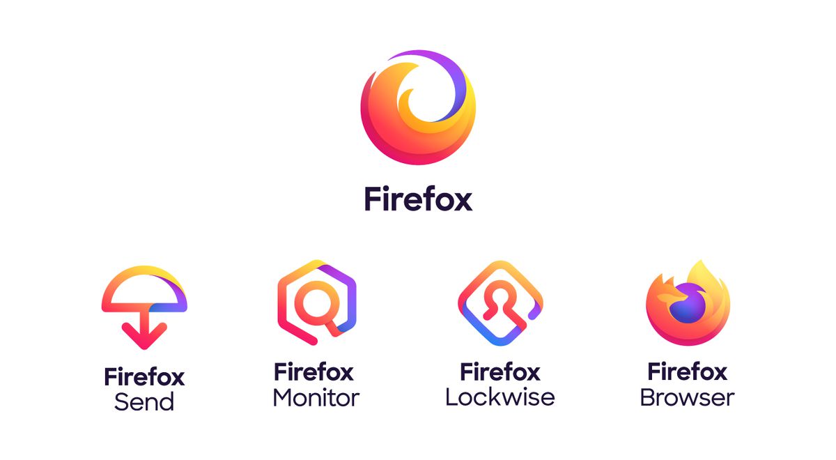
See? Fox is alive and well… if a little ethereal. The logo also looks a little like a world on fire, which many of us can easily identify with these days. I think it will grow on me.
Below is a little comparison image which I whipped up so you can see how the Mozilla Firefox logo has changed over the years:
![]()
Around July last year, designers at Mozilla announced to the world that the Mozilla logo would need to evolve to encompass a larger family of products. In the statement which was released, the designers said that “as an icon, that fast fox with a flaming tail does not offer enough design tools to represent this entire product family” — and revealing that they could either go foxier or more swooshy. Did they make the right choice?
So what do you think about the new logo? Do you think the logo should have been more fox and less fire? Let us know what you think in the comments below. Also, feel free to ask any questions you may have and also share any information you may have as well.