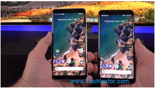
As expected, Google announced Android P Beta after deploying the Developer Preview. Here are all the features of this new version.
Page Contents:
New features of Android P as updated on May 12, 2018
As it is now customary, Google began last March with the deployment of the Android P “Developer Preview” version, the next major update of the system. Android P Beta arrived at the Google I / O, directly available for many devices, 12 smartphones in total including OnePlus, Sony, Nokia or Xiaomi.
Here is a more or less exhaustive list of new features seen on Developer Preview but also the last Beta.
Android Beta (May)
A new navigation
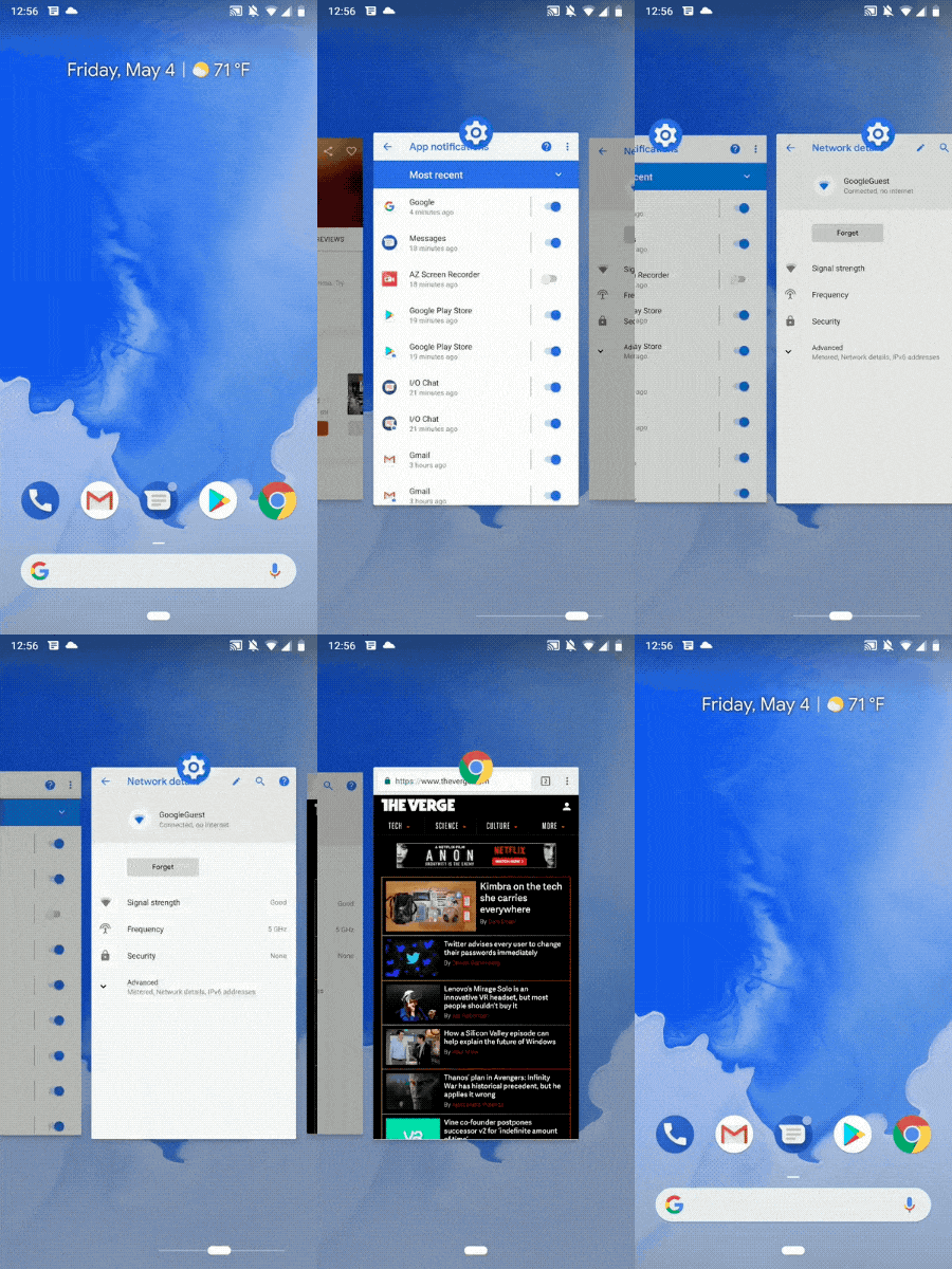
It explains that these gestures come from the iPhone X, it’s not nonsense. Indeed, with Android P, Android changes its navigation system. Now, on the home screen, the phone shows only one button, home, a little longer than it is today.
By sliding it to the left or right, you can quickly access minimized applications.
- Touch – go to the home screen
- Long press – launch Google Assistant
- Dragging it half screen – go to the multi-task screen
- Full Scan – Open the application drawer.
- Swipe to the right – scroll through recent apps
- Back button – go back (only appears in applications)
Actions App
Google introduced the App Actions; the idea is simple – use the context to give you smart suggestions based on what you like to do the most and automatically anticipate your next action. App Actions, for example, help you get to your next task faster by predicting what you want to do next. If you connect your headset to your device, Android P will pop up an action to resume your favorite Spotify playlist. Actions can appear throughout the Android system, in places like the Launcher, Smart Text Selection, the Play Store, the Google Search app, or the Assistant. Developers will undoubtedly have the opportunity to integrate App Actions into their applications.
slices
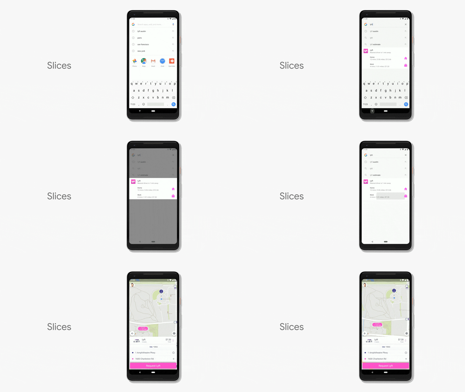
App Actions are a simple way to help you quickly get what you need; but what if you could show part of the application itself when you need it most? Slices offer this feature. As the GIF below shows, if you search for “Lyft” in Google Search, you can see an interactive “slice” that gives you the price and time for a VTC route, so you can quickly order the ride.
The battery that fits
Android P incorporates a more advanced battery management tool. Like what is already found in Samsung or Huawei, Android P Beta offers Adaptative Battery. Google has partnered with DeepMind to build Adaptive Battery, which gives “power” priority only to the applications and services you use the most, to help you improve the battery life of your device. This is called machine learning, and it’s also integrating for the screen – Adaptive Brightness which learns how you like to adjust the brightness slider to suit your environment.
To not be disturbed
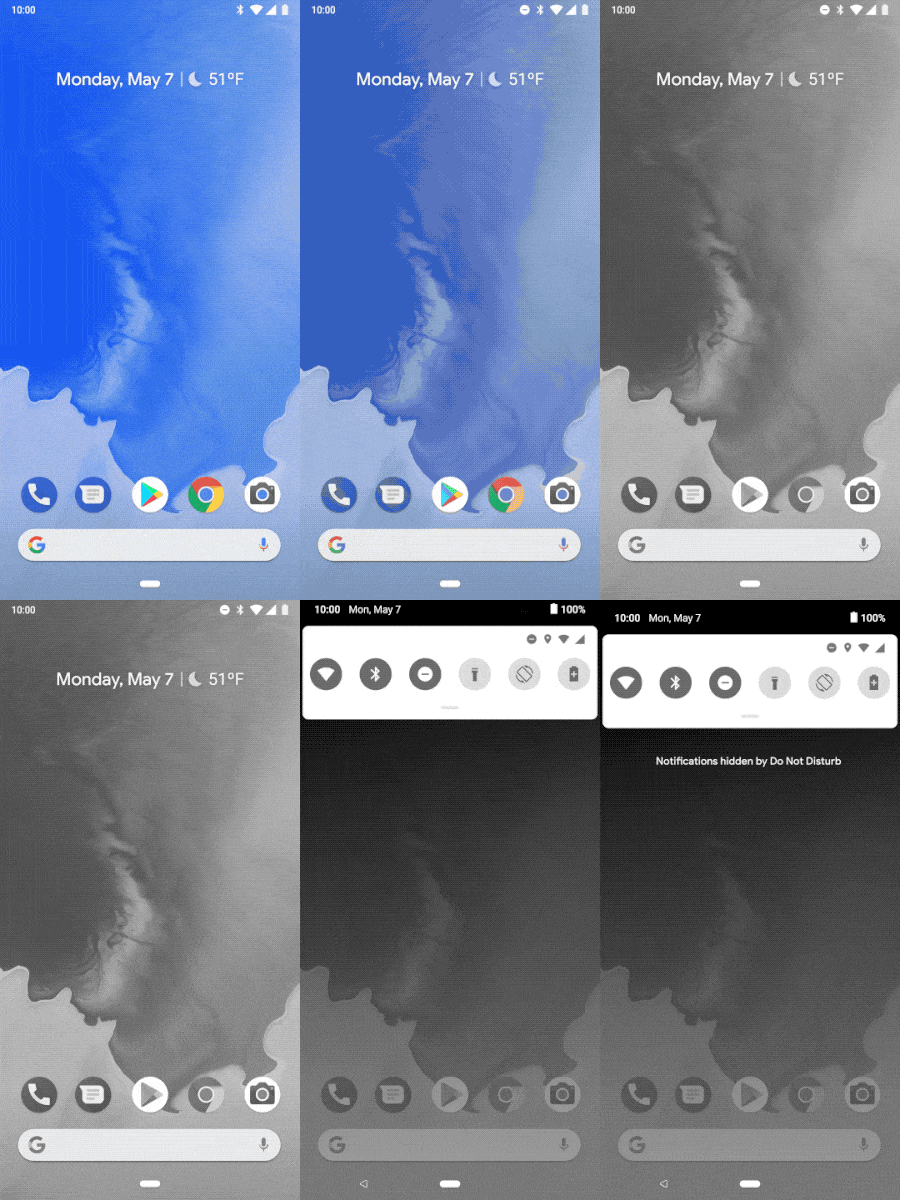
The “Do Not Disturb” mode has evolved well. The novelties are many… the first is Wind Down, an automatic Do Not Disturb mode that turns on the night light when it’s dark. Once it’s time for bedtime, the new mode removes all the pretty colors from your screen and turns the display into grayscale. This should make things harder for people to use their phones for an extended period. Then, there is an update of Do Not Disturb itself, which silences any visual notification, in addition to phone calls and notifications.
Finally, Shush is a new gesture that allows you to turn off your phone’s screen on a flat surface and automatically activate the Do not disturb option. You can still select certain contacts to receive messages and notifications, even if your phone is in Do Not Disturb mode. Of course, many features of Android P were already available on custom user interfaces, such as those of Huawei, Samsung, Xiaomi, Asus or LG.
Android Dashboard
Android Dashboard will check all the activity of your smartphone over the last 24 hours – what applications did you use, how long, the number of times the screen was unlocked during usage… an article dedicated to this feature is available HERE.
Screen capture tool
Google has also reviewed the screen capture system – as on the interface of Samsung or Huawei, it is possible to retouch the image, trim or add annotations on it.
Android Developer Preview (March)
An interface designed for the “notch.”
Smartphones with edge-to-edge design are multiplying, and with them, the question arises of the integration of the various sensors required on the front. While some redouble ingenuity to position them in the small spaces available, others prefer to opt for the easy way to Apple and adopt the “notch,” in the screen in which the light sensor, the camera (s) and the speaker.
With Android P, the interface is redesigned for these new screen formats. Developers can, therefore, use a dedicated function, check the presence of this dead zone and compose with. An option in the system developer settings also allows simulating this notch to check the display of applications being developed on a screen truncated.
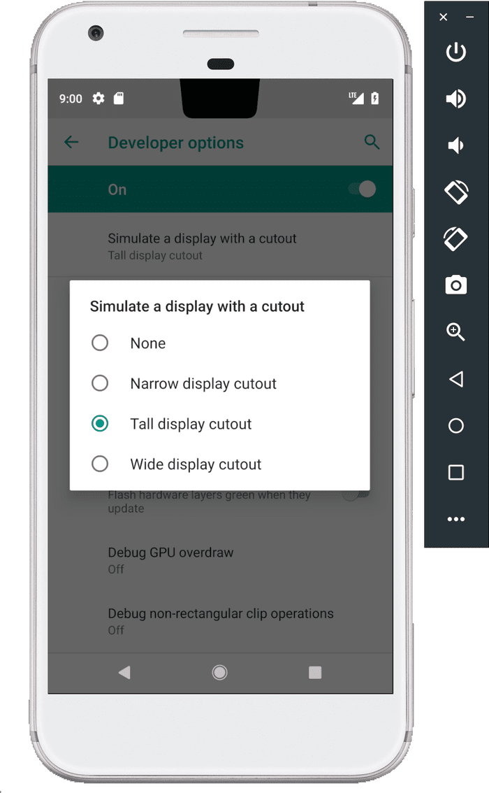
Note on the screenshot above the movement of the clock in the status bar, now present in the upper left corner. Hard to say for the moment whether it is a simple option or a fixed and permanent migration.
A new interface for notifications
After the changes of Android N and O, Android P changes the aspect of the notifications again. First, quick notifications are now displayed in shades of gray in order to stand out better. It is true that the display was a little dull on Android O and can better discern the operating parameters or not.
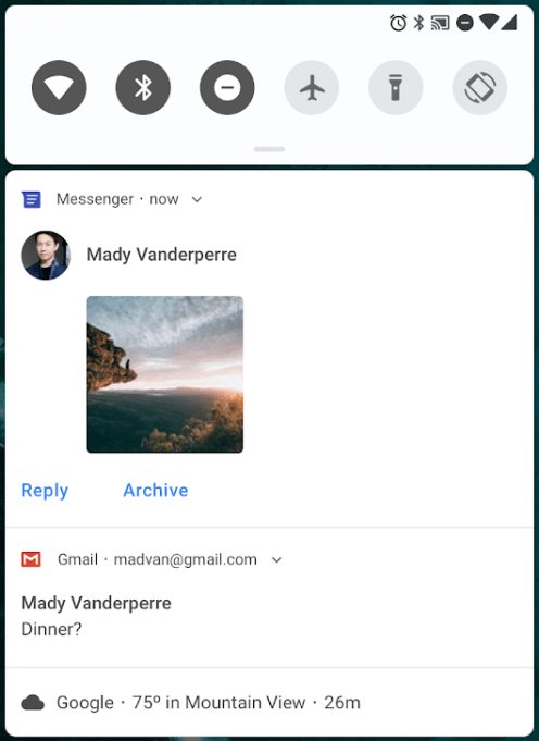
The notifications themselves also change with an ever more streamlined interface and the addition of “smart replies,” such as on the recently uploaded Reply application in beta by Google. Messaging can also correctly display multimedia files in this area.
Parallel to this, the parameters found a touch of color for a system a little more cheerful and more comfortable to discern.

A more fluid photo interface
The new Android P APIs also incorporate better management of multiple photo modules. The fluxes of the various sensors are now merged to make the passage from one optic to another more fluid, especially when they have really different parameters (focal length, aperture). Switching from one optics to another or from a normal mode to a “bokeh” mode should theoretically be faster and easier for developers to manage.
In addition, developers will have access to both streams simultaneously.
USB charging and transfer
When a phone is connected to a computer via USB, it gives the user the option to choose between different options, including charging and file transfer. With Android P, this menu has been revised to allow users to select two simultaneous actions, including file transfer.

Volume and sound
Volume management has always been problematic on Android with this window that opens in the middle of the screen and never changes the volume. Now, the volume buttons adjust the media volume only, and the window is now positioned on the side. A button also allows you to choose the multimedia output when several solutions are connected. We can connect up to 5 Bluetooth devices, even if they will not work simultaneously of course.
Note also that Google has added options for excellent management of vibration of the phone, for actions on one side and for calls on the other. Four levels are available – Off, Low, Medium or High.
WiFi localization indoors
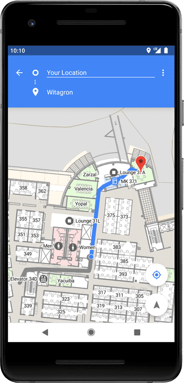
Indoor geolocation is still a problem, as GPS need to have access to several satellites to function correctly. Android P takes advantage of the IEEE 802.11mc WiFi protocol to measure the distance between accessible WiFi access points. This makes it possible to obtain a position, even inside a shopping center for example, within 1 or 2 meters.
Note that for this, it is however necessary to have a compatible smartphone and to have given the appropriate permissions to the application.
Increased security
As we already know, the security has been improved in Android P. Thus, applications that run in the background can no longer access the microphone or the camera. In addition, sensors such as accelerometers or gyroscopes stop sending information.
A screenshots editor
Long press on the power button now has three options – “power off,” “restart” and “screenshot.” A new image editing software has been added and is proposed during a capture.
Support for HDR VP9 videos and HEIF format images
Android P now supports the HDR VP9 Profile 2 and the High-Efficiency Image File Format (HEIF). The first will allow compatible devices to display more easily HDR content, including YouTube or Play Movies for example, while the latter offers a more efficient compression of images. In theory, we are talking about images containing twice as much data as a simple JPEG for similar file size.
A better-optimized system
Android P contains a large number of improvements and optimizations. Among other things, changes in ART (Android RunTime) promise a faster launch of applications and lower consumption of RAM, while refinements of Doze and App Standby modes should increase the autonomy of our terminals.
The energy saving mode has also been reviewed and can now be activated automatically when the battery life reaches a certain percentage of battery, now set by the user between 5 and 70%. In addition, the status bar no longer turns to neon orange when this mode is activated (phew!).
Also, note that the remaining battery percentage is now displayed on the phone’s idle screen.
Standardization of fingerprint sensors
Applications that ask the user to put their finger on the fingerprint sensor for one reason or another are many, but all do it in their own way. To standardize this, Android P adds an API with a clear and accurate display of the fingerprint request.

Applications using the Network Security Configuration will have their unencrypted traffic blocked so that HTTP connections go into TLS for more security. The user can however choose a transfer in clear under certain conditions.
In addition, the autocompletion function implemented in Android N has been improved to increase its compatibility with different password managers.

